Adobe in Design → Elementor
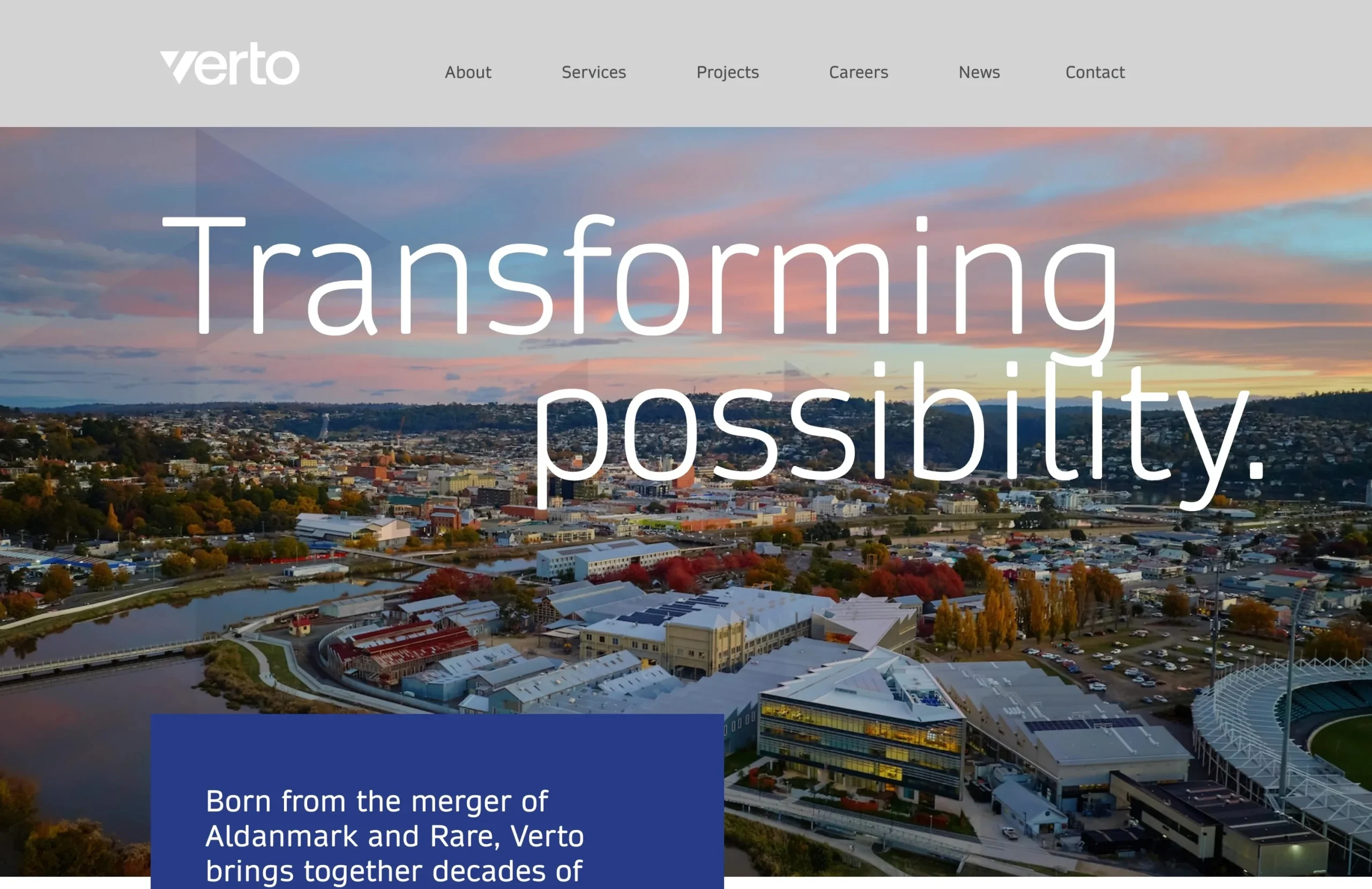
Verto: from an InDesign document to a 25-page WordPress site
Client Verto (Aldanmark + Rare)
Sector Engineering and project management
Scope Full website build from a supplied Adobe InDesign design
Stack WordPress, Elementor, Hello Elementor, custom post types, Yoast SEO
Year 2025
Live https://vertotas.com.au
The brief
Verto needed a site that could carry a merger. Two established Tasmanian firms, Aldanmark and Rare, were becoming one brand, and the website had to introduce the new name without losing the credibility of the old ones.
The design arrived as a finished InDesign document. Not a wireframe, not a component library, a composed piece of artwork: oversized editorial headlines in Daytona, body copy in Aeonik, warm paper backgrounds, deep blue statement blocks, and full-bleed aerial photography of Tasmanian bridges, coastlines and buildings.
My job was to turn that artwork into a working site without flattening what made it feel designed. The scale of the type, the wide margins, the images that run edge to edge, and the blue blocks that overlap photography all had to survive the move to a browser.
Why an InDesign file is a difficult starting point
InDesign is a print tool. Every element sits exactly where the designer put it, in a fixed frame, at a fixed size. A browser has no fixed page. It has a viewport that changes from a 27-inch monitor to a 390px phone, and text that reflows whether the design wants it to or not.
That creates four specific problems:
- Fixed positions become fragile layouts. Absolute placement that looks perfect at 1440px collapses the moment the screen narrows.
- The type scale is built for one width. A 120px headline is dramatic on a desktop and unreadable on a phone.
- Images are cropped for one frame. Full-bleed photography needs a crop strategy, not just a file export.
- Print assets are not web assets. Fonts, colours and image resolutions all need to be translated properly, not exported and hoped for.
Most of the build was solving those four problems without visibly changing the design.
The approach
1. Read the file as a system, not a set of pages
Before building anything, I mapped the InDesign document into repeating patterns: the hero, the blue statement block, the paired image and copy section, the project grid, the service list, the footer. Almost every page was a combination of those parts.
That mattered because the site is large. Building 25 pages one at a time would have produced 25 slightly different versions of the same section. Building the system first meant the spacing, type and image behaviour stayed consistent everywhere.
2. Build the repeated content as structured content
The site has 24 projects, 71 team profiles and nine service pages. Those are not pages someone should rebuild by hand every time a new project is won or a new engineer joins.
Projects and people are custom post types, with categories for project sector and team division. A new project is added through the normal WordPress editor, appears in the right category archive, and inherits the same layout as every project before it. The same applies to team profiles: name, role, qualifications, division, biography and CV download.
That decision is the difference between a site that gets updated and a site that slowly goes stale.
3. Keep the navigation usable at 26 links
Verto has six top-level menu items and 26 links across four dropdown panels. On a desktop that is a lot of information to present without turning the header into a directory. On a phone it is worse.
The dropdown panels are built as reusable Elementor templates, each with a short editorial statement at the top so the menu still sounds like Verto rather than a list of URLs. On mobile the whole system collapses into a single menu, and the panels become accordions rather than hover states.
4. Solve the small screens before the last week
The mobile layout was not treated as a cleanup task. The oversized headlines were rebuilt with a fluid type scale so they shrink in proportion instead of jumping between breakpoints. The overlapping blue blocks became part of the normal document flow on narrow screens, so they stack cleanly under the photography instead of sitting on top of it. Images were cropped with a focal point in mind so the subject stays in frame at every width.
The test was simple: if the page still read like Verto at 390px, it was working.
What I built
- 25 pages, including home, about, careers, news, contact and a launch RSVP page
- Nine service pages, each with its own content and shared layout
- 24 project pages with nine sector categories
- 71 team profiles, organised by division
- Three office locations: Hobart, Launceston and Devonport
- Reusable header, footer and mega-menu templates
- Self-hosted Daytona and Aeonik brand fonts
- Yoast SEO configuration and semantic heading structure
- Responsive layouts tested from 1440px down to 390px
The details that carried the design
Type. Daytona is a light, wide display face. It only works at scale, so the headlines keep their size and tight tracking on desktop and scale down proportionally rather than switching to a different font. Aeonik carries the body copy at a comfortable reading size, with generous line height.
Colour. The deep blue (#283A89) is used as a structural block, not a background wash. It holds the longer statements and gives the page a rhythm between photography and paper. The warm off-white keeps the site from feeling like a generic corporate template.
Images. The aerial photography is the brand’s strongest asset. Rather than cropping it into neat cards, the layout lets images run full width and overlap the blue blocks, which is what gives the pages their editorial feel. On mobile those overlaps resolve into a clean vertical sequence.
Space. The InDesign artwork uses wide margins and a lot of air. Most of the build was protecting that whitespace, resisting the urge to fill it, and making sure it scaled rather than disappeared on smaller screens.
The outcome
The site launched at vertotas.com.au as the public face of the merged practice. It carries the full service range, the project archive and the people behind the work, across three offices and two legacy brands.
The practical result for the client is ownership. New projects, new team members and new service content go in through WordPress and Elementor, using the same templates as everything else. They do not need to call a developer to publish a project, and they cannot accidentally break the design while doing it.
For me, the interesting part was not the page count. It was proving that a print layout can survive the trip to the web if you treat the InDesign file as a design system rather than a picture of a website.